Most companies aren’t that great at publishing job descriptions that stand out. In today’s tight job market however it’s more important than ever to create something that a job seeker can easily understand and grabs their attention.
So we sifted through the jobs on JobsInME and found some that do a better job at attracting job seekers.
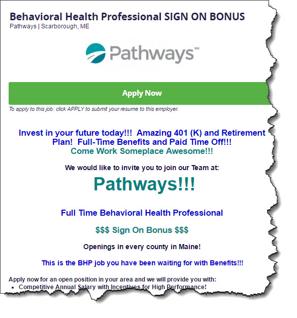
This one from Pathways uses color to make it more readable.

Use the formatting options in your job posting dashboard when entering your descriptions. You can easily markup your posting just like Pathways does. Break up the text, create a few lines with bigger letters, bold stuff, underline, get creative!
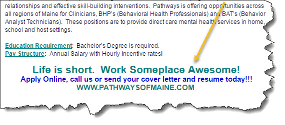
They also have a great sign-off at the bottom of their jobs. A tagline about your workplace is a great idea to have.

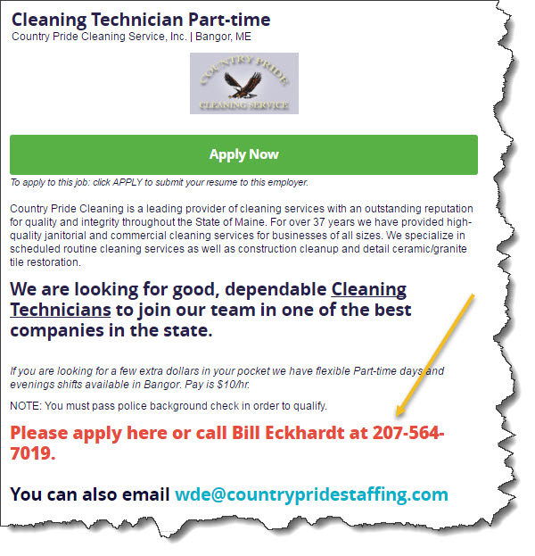
Adding your phone number, especially for those hard to fill roles is also a good idea.

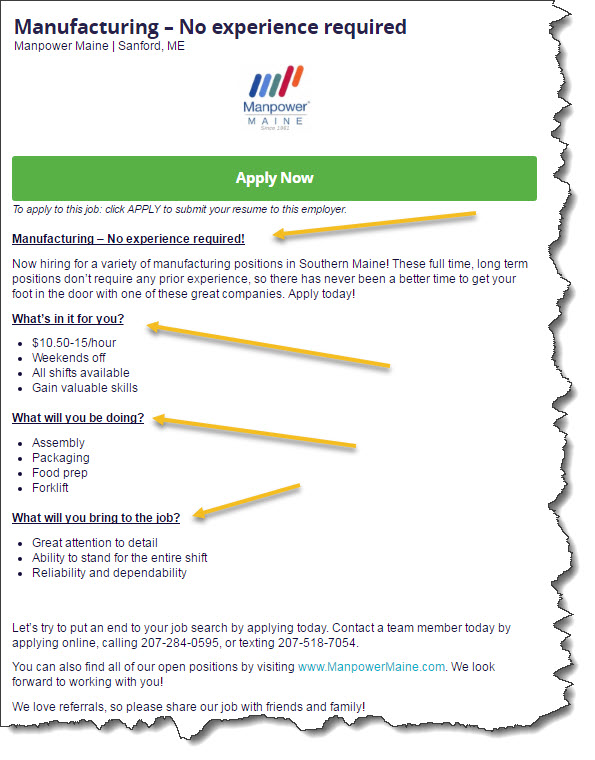
This ad from Manpower also does a good job of “chunking” the job description into 4 easy to read headings that are definitely more interesting to a job seeker like “What’s in it for you?” and “What will you be doing?”

So there’s a few good examples for you to emulate. You might want to review what you have posted with us and make a few changes based on the ideas above.
